Graphic Dinner
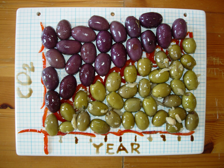
Course 1: Olive Plate
Northern Hemisphere CO2
materials: purple and green olives, red pimientos, balsamic vinegar and honey.
This graph changed my life. I was doing cancer cell biology research when I saw this graph in an environmental toxicology course. What struck me was that every year, there was a characteristic dip (focus on the red pimientos) which corresponded to plant absorption of CO2 during the growing months. That little dip was consistent; plant growth was limited relative to the overall increasing trend. Therefore, all the biomass in the northern hemisphere cannot currently sequester carbon at a rate comparable to our emissions. Fossil fuel is just ancient biomass being combusted to the atmosphere at an unprecendented rate. The finite surface cannot capture the carbon at an equal rate. We have a phenomenon.
To learn more about this graph, click here.
Course 3: Fruit Plate
Historical Sources of US Energy Use (1635-2008)
materials: hydro electric blueberries, nuclear kiwis, wood pomegranite seeds, coal papaya, petroleum pineapple, natural gas persimmon. (quadrillion BTU from 0-50)
What is in this chart is as interesting as what is not. (the pomegranite seeds mark the year1800)
To learn more about this graph, visit the Energy Information Agency, Figure 5.
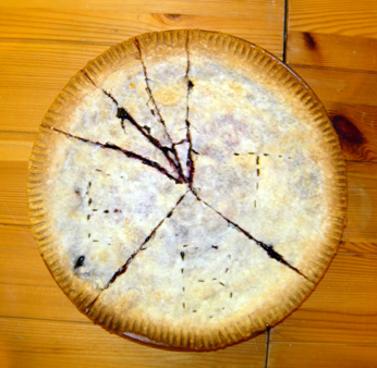
Course 6: Blackberry Pie
NY Energy Use by Sector
This blackberry pie chart is a chart from the 2003 Pataki Greenhouse Gas report. That report marks NY State as the 16th largest state in the world in greenhouse gas contributions (more than states like Chile, Sweeden, Austria). NY contributes nearly 1% of the global total annual emissions. This chart depicts the sources of our emissions, rougly split in thirds between Transportation, Building (Heating), and Electricity.
To learn more about this somewhat outdated but still good resource, click here.
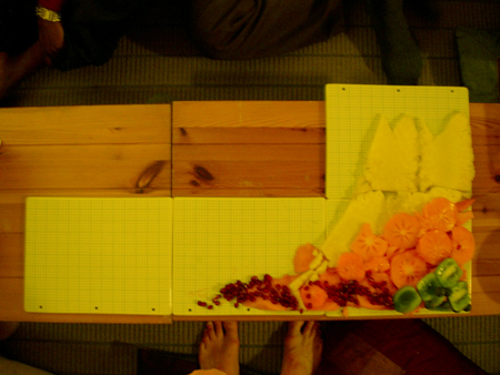
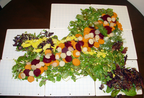
Course 4: Salad Plate
NY Current Land Use Map & NY Hay Yield Scatter Graph
map materials: fennel forest, general agland mesclun greens, urban area red lettuce, corn row crop agriculture. NY is ~54% forest, 23% agriculture, 9% urban, 8% wetlands, 3% open water, 3% other.
scatter graph materials: beets, sweet potatoes and water chestnuts mimic a NY hay yield scatter graph.
The map illustrates what finite land resources we have to grow from. From this scatter graph and other data, our research group estimated switchgraph yield potential across soils in NY State.
To learn more, see Appendix E of the NYSERDA funded Biofuels Roadmap.
Course 5: Risotto
How Linear Adds Up to Exponential
mushroom and coconut risotto, grilled scallion
This is a concept graph of relationships. I served 2(^4) guests. Each plate represented a different base resource (copper, wood, lime, iron etc). Imagine the figure at the top is a graph of growth of copper use for electrical wiring. The grilled scallion represents a linear (depleting) use of fossil fuels required to mine this copper. The bottom graph is linear growth of CO2 as these fossil resources are combusted releasing carbon that was formally buried deep in the earth thus changing the balance in the atmosphere.
This series of linear growth relationships for one little industry (copper), when combined with all other industrial growth (iron, potassium, nitrogen, aluminum) add up to an exponential increase of greenhouse gases in the atmosphere. This very 'normal' and banal additive behavior is the very real way in which our economic growth model currently compounds climate change.
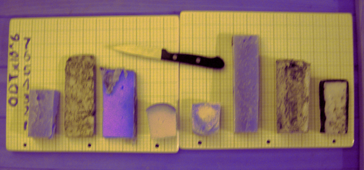
Course 2: Cheese Plate
NY Biomass Potential
Materials representing Oven Dry Tons (ODT) of Biomass : From Left to Right
1. aged goat gouda (current forest) 2. Gorganzola Picante (current forage and hay) 3. Red Leicester Sparkenhoe (current corn silage) 4. Coinga Mahon Curado (current corn grain) 5. Amanteigado (other) 6. an aged gouda (max additional forest) 7. St. Maure (max additional grasses) 8. a delightful blue (I forgot the name - max additional short rotation willow)
NY state currently produces just under 16 million oven dry tons of biomass for food, feed, fiber, and fuel. It could harvest an additional 14 million oven dry tons (for bioenergy or other purposes) sustainably with signficant societal committment.
To learn more about this graph, download Appendix E pdf here.
December 6, 2009
One Night Stand Gallery, Brooklyn NY 11218
To kick off the Copenhagen Climate Talks in December 2009, I hosted a 6 'course' meal to 15 guests.
Each course, depicted an important scientific graph regarding climate change, including some of my current research work with colleagues at Cornell.
I have been doing research on agronomic impacts to climate and sustainable bioenergy production since 2003. I struggle with how to inform my friends about my work and the imperative of addressing fossil fuel consumption. Here, they ate away my words, sensually.